Design System high 4
A new design system for LOTTO24
A good and functioning design system has many advantages for product development. On the one hand, the user can use the product better because the design is consistent and well thought out.
mauricegesswein
Jun 25, 2021 . 6 min read
A good and functioning design system has many advantages for product development. On the one hand, the user can use the product better because the design is consistent and well thought out. On the other hand, product teams work more efficiently because there is a common basis and language. The establishment of a design system is not easy, especially with existing products, because the design has grown over the years and is no longer consistent. A good opportunity is to introduce the new design system in the course of major reconstruction work on the product. At LOTTO24, we in the UX team used exactly this moment and developed a design system for four Lotto webshops within a year. The design system therefore had to be flexible enough to be able to map four different design languages. In this article, we give you a brief insight into the challenges, the approach and our most important findings.
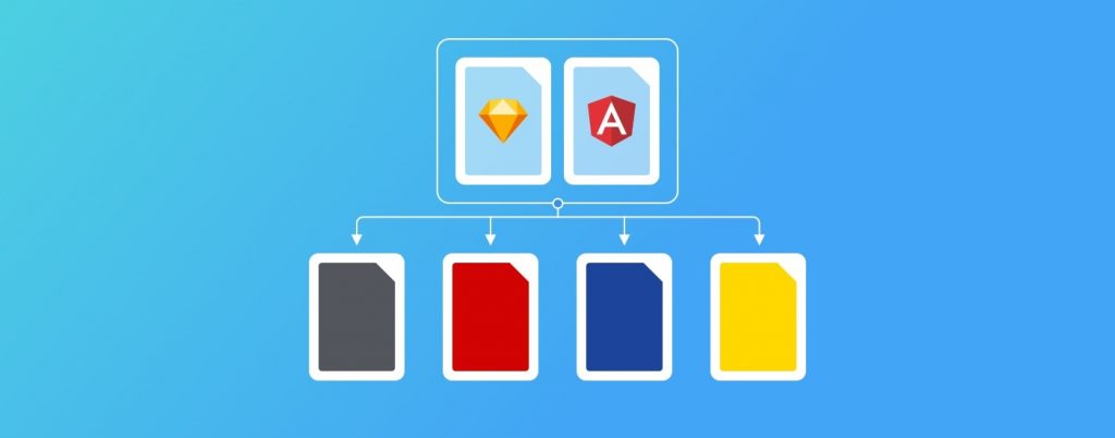
Four different lotto webshops belong to LOTTO24 (LOTTO24, Tipp24, WEB.DE Lotto, GMX Lotto). With these four webshops, each target group can be offered a different lotto experience in a different brand world. Many functionalities are similar, as the use cases are the same (fill in lottery ticket, buy lottery ticket etc.).
Of course, the maintenance overhead of running four lotto web stores is high. Not to mention the complexity for the product teams to further develop and optimize them for customers. Without the appropriate “framework” in the background, this is virtually impossible. That’s why the “UNITY” project was initiated. One of the aims was to standardize the technical “framework” in the form of a component library that can be used by all webshops. Parallel to this component library, a new design system was to be developed.
One design system for 4 different webshops
Here are our starting requirements for the design system at a glance:
One design system for four different lotto stores
Unify as much as possible, so that one component (e.g. login) works the same for all four stores, but looks different
Modernize the design language for all four brands
The customer should notice as few major changes as possible, which would interfere too much with his usual usage behavior.
In order not to lose the overview and the user focus with so much complexity, we initially divided the project into digestible bites. The product managers in particular put a lot of energy and nerves into this division, while the UX team focused on the user and the design. The UX team focused on the workflow in the design team and on the topic of “design decisions”. So at the beginning we agreed together on a suitable design management approach.
With such a large and cross-team project, many participants have to be involved from the very beginning and coherent work packages have to be processed. In retrospect, our approach has really proven its worth, so here is an overview of the individual components.
UX Matrix and own UX Board At the beginning we created a “UX Matrix” in Excel. Of course, this was done in the online version so that everyone could access it. This matrix showed all the modules we had to consider for the design system, the status (e.g. Open, Analysis, Mockup), the responsible team and the pages where the modules appear. In Jira, we then transferred all UX tasks into a backlog. In the weekly Grooming we discussed the tasks and then in the Daily we exchanged ideas on a daily basis. This all ran in parallel with the work and dailies in the dedicated product teams.
Design Decision Meeting It is usually the design decisions that hinder project progress or lead to time-consuming changes afterwards. Often, stakeholders have not been sufficiently consulted or the designs simply do not work well enough. Unfortunately, the user’s perspective is also lost in the hectic day-to-day project work… To avoid these problems right from the start, we set up a regular “Design Decision Meeting”. The group consisted only of the most important participants and we were very careful not to make it too large.
In the meeting, we compared the status quo of the stores with the possible new variants. The decision criteria were as follows:
Unification: Are the components sufficiently unified so that the whole thing does not become too complex and remains maintainable?
User acceptance: Is the change too big for the user and will it perhaps affect them negatively?
Design quality: Are we really confident in the solution as the best approach we can offer the user?
Data: Is there data e.g. from UX tests or A/B tests that speaks for one of the variants?
Flexible Axure prototype for testing Regular testing was essential for this project. We knew this and set up an Axure prototype for all viewports from mobile to desktop at an early stage. Initially, this prototype only mapped the page structure and navigation. We could then quickly and easily add the appropriate content to the prototype before the respective tests. For more complex content (e.g. the lottery tickets), we included real code from the developers to make the test as real as possible.
Design Libraries and Guidelines We maintained the design guidelines and the corresponding libraries from the beginning. This included the basic elements such as colors, buttons, forms, new page layouts, etc. that were already created. We had already worked this out in the course of a UX project on the new design language and navigation. Without this preliminary work, the project would have been difficult to implement in this time frame. We could easily use the existing designs and guidelines and apply them to the new design system.
Throughout the project, the UX team’s work took place both in the dedicated product teams and with the other UXers on cross-cutting issues such as unification. Coordinating and creating understanding around these parallel workstreams was not always easy. So it was all the more important that we had a common approach to this project right at the start.
The collaboration in the UX team was very intense and good. We all worked with Sketch and always used the latest overarching Sketch libraries. There was a separate library for each brand or store, but with the same structure. Each UXer uploaded his current status in Abstract and so the latest work status was always visible and usable for everyone.
A lot of work went into maintaining and building the libraries, of course. But this way, new designs (example: customer account) could be created quickly from the stored components and then quickly adapted for the other brands in the next step.
We used Zeplin for documentation and for the final handover of the designs to the developers. Providing components and page layouts via Zeplin has enabled us to create pixel-perfect hand-overs that include all specifications such as color, font size, line-height, spacing etc. In addition, Zeplin offers the ability to export icons, pictograms and logos as SVG, PNG or JPG with one click. This saved a lot of work sending files back and forth. Colors and text styles can also be named, so design and development could speak the same language.
The developers then built up from the designs into the new theme-able Component Library. This library was built using Storybook and based on Angular. The exchange with the developers was very close throughout the whole project.
Here again our toolset at a glance:
Create mockups and final designs with Sketch
Preparation of design decision meetings and the variants with Marvel
Collaboration/deposition on the designs via Abstract and corresponding libraries
Documentation and delivery with Zeplin
Prototyping for UX testing with Axure
The design system was named “Carrera”. The corresponding component library based on Angular is called “ng-carrera”. Carrera stands for the faster and more powerful version of the previous technical base and the allusion to a well-known toy and car brand was very conscious to us.
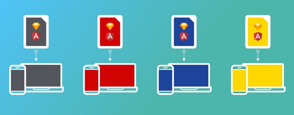
The Responsive ng-carrera Design System
In the design language and structure of the library, we were very much inspired by the Google Material Design standards and, of course, supplemented and extended them. For the basic metrics, we followed Google’s Material Design or the 8×8 and 4×4 pixel grid. In previous projects, this system has more than proven itself. It creates a solid foundation for all UI objects, which can ultimately be used like Lego building blocks. Individual elements can be easily combined with each other and the entire layout of all webshops is built on the same grid system.
From a visual point of view, the new design system for the individual brands/webshops has not changed much, as the existing brand language of colors and fonts has only been slightly refreshed. At Tipp24, for example, new H1 headlines with Montserrat as the font were introduced and the condensed cut of Roboto was dropped. Structurally, of course, we had to make more adjustments to the design system due to the standardization of the four webshops. Navigation and page layout were of course very different in the stores and it was tricky to find good common solutions. However, we tested all major adjustments intensively with the users and always considered carefully whether the change made sense or not.
So that this article is not only about the positive sides of the project, here is a brief overview of the biggest challenges from a UX perspective:
Detachment from previous UX workflows: quickly switching to “major project” mode was not easy, as we had to rethink “how do we work together in UX” within a few weeks.
Complexity: keeping track of the status quo of the four webshops with the possible new and unified design variations was a big challenge. Fortunately, the product managers had initially focused on the LOTTO24 and Tipp24 webshops. Even thinking and designing for two webshops at the beginning was intensive, especially with topics such as ticket history.
Communication: Communication simply took a lot of time, as there were many people to meet and involve.
Keeping design documentation current: When the designs were handed over to the developers in the often changes occurred. Due to the tight time frame, we often did not manage to update the designs in Zeplin. This in turn led to misunderstandings in the QA phase before launch.
Of the challenges, we solved most, but not all. The issue of keeping the design documentation up to date, for example, stayed with us until the end of the project.
Overall, the project went very well and we also received a lot of positive user feedback. With the UX team, we moved four webshops to the new design system within just under a year. And we did this with a fairly small team. The closely meshed joint workflow with the appropriate design tools helped a lot. And also the close and good communication within the team via Slack & Co. Despite the remote situation, it worked really well.
The topic of design decisions also worked well. The design decision meetings were sometimes time-consuming in preparation, but paid off in the long run. Decisions were always made in this round justified (UX tests, data, …) and with regard to the impact for the user.
Of course, due to the time constraints and also the team strength in UX, some points fell short. For example, keeping the naming of the components in Sketch and in Storybook (the developers’ tool) consistent from the beginning. In some cases, different names were used in Storybook during implementation than in the Design Library. The communication with the developers was close, but in retrospect it should have been more intensive.
And last but not least – the documentation of the design guidelines in Zeplin is time-consuming to maintain and difficult to understand, especially for “non-UXers”. That’s why we are currently working on setting up a separate design documentation that will provide an easy introduction to the new design system. But overall our approach and tools have proven to be a lean and efficient solution, so we wanted to share our experience with you.